Staying Power
]> How brand signature and image bolster consumer recognition With product competition as fierce as it is today on just
April 6, 2018

]>
How brand signature and image bolster consumer recognition

With product competition as fierce as it is today on just about every retail shelf-from food chains to high-end apparel specialty stores-keeping close to your brand, and its roots, can aid time-crunched consumers bombarded by choices. While many consumer product brands have "tweaked," "modernized," or "contemporized" their logos or visually updated their packaging over the years, marketers must be careful not to "tweak" too much as an identity crisis may be the end result. Regardless of visual design changes, one constant should remain for the consumer: quality. A recent EquiTrend Best Brands study (see chart below) confirms that sentiment. Winning brands-the Sears Craftsman label led the list-delivered on their promise to consumers with quality products. Not far behind: Waterford Crystal and Rolls Royce, which top their markets in the quality category, as well. It's a marketing 101 concept that works no matter what your logo looks like.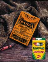
So, just how far should you stray from your brand's image and signature without ultimately affecting consumer brand recognition and shelf staying power? License! put this and other questions to key executives at various consumer product companies, who maintain that while visual enhancements can be effective, consumer awareness and loyalty remain crucial to the creation and consistency of a brand, particularly when licensing comes into play.
Brand Awareness
For those companies that may have inherited some unattractive logos, take heart. If you have the right brand stuff, it may not matter. "Consistency is key," says David Carter, author of "The Big Book of Logos," among other design and logo books. "A not-so-well designed logo used consistently is much better than a well-designed logo used inconsistently."

So agrees Susan Feeley, director, licensing, North America, of Atlanta-based Coca-Cola. She explains that Coca-Cola has "learned to stay as close as possible to the true company brand and logo. Over the years, we've tried different logo treatments and colorations, nostalgia images, and both bold and subtle placements of the logo," Feeley notes. "But the more closely aligned we are to the brand and the true logo, the better the product sells. And that makes sense. After all, they are buying because it's Coca-Cola."
Crayola, which celebrates its 100th anniversary next year, has changed its logo and packaging 10 times since its beginnings in 1903. However, to support the changes it has made over the years, Crayola conducted focus groups asking consumers what they most recognized about the brand. The Crayola name? The yellow and green colors? The chevron design? While all three of these items were key recognition factors, the green and yellow colorations of the crayon box were most identifiable. Diane Adams, manager, global licensing for Easton, PA-based Crayola, Binney & Smith, maintains, "We can't separate the brand from the logo." The brand boasts a 98 percent unaided brand awareness factor, according to Adams.
"Because our properties are magazines, we start with a wealth of demographic information about who our readers are," explains Jackie Blum, president of Los Angeles-based Primedia Enterprises, established in May 2000 for licensing and other business opportunities for Primedia Publishing (with 300 magazine titles ranging in diversity from Seventeen to Motor Trend, Canoe, and Automobile). Recently, based on consumer research, Primedia titles Automobile, Teen, and Seventeen updated their logos. "People have strong opinions, and teens in particular will dismiss anything that looks old or dated. That's why both Teen and Seventeen went from solid to multicolor logos with updated fonts," Blum says.
Consistent use also may create a logo, as it did for The California Milk Board. The "Got Milk?" licensing phenomenon began as a simple advertising campaign, with no thought that it would become an added revenue stream of $2 million annually for the organization. "When it began to expand-with a Mattel Barbie in 1995-and even since then, we've turned down a number of queries about changing or creating a different logo," says Executive Director Jeff Manning. "We're a testament to consistency. It's seven letters, all lower case, usually on a white background. You can't miss it."
Harley-Davidson is another testament to consistency. Unlike many well-established brands, which will tweak and modernize their logos periodically, the Harley-Davidson logo has not changed in almost a century. "Why mess with a good thing?" asks Joanne Bishman, head of worldwide marketing, Harley-Davidson, Milwaukee.
The same is true for New York-based Playboy Enterprises, which has kept its Rabbit Head symbol intact since its creation in 1953. "The Playboy Rabbit Head is one of the most recognized symbols in the world, so we put it on many products, which conjures up the lifestyle and heritage instantly," says Playboy spokesperson Lorna Donohoe. "When we launch a new product line in a new territory, the Playboy Rabbit Head is very much a focus of the design to ensure immediate brand recognition and excitement. In seasons to follow, however, the logo is used more subtly, and the product design is the hero."
Design Flexibility
When it comes to licensing brand names, licensors and licensees must work hand in hand to ensure the brand's overall mission and message are consistent. However, design flexibility exists, particularly with brand extensions into other product categories. Companies such as Crayola allow licensors/ licensees more flexibility with their signatures, but the brand mission has to mirror Crayola's "color-added" message. "We look for licensees to provide products with a foundation of design that makes it Crayola," says Adams. "That can mean color change technology, glow-in-the dark features, or bedspreads that double as play areas with roadways or school yard pictures." But, as logos go, the company is "very specific about the use of yellow and green, the chevrons, and the swash." The "swash" element, a rainbow that underlines the name Crayola, was the last update to the logo in 1994. Crayola recently retained Nancy Bailey Associates, Inc., Coral Gables, FL, to help it expand into domestics, personal care, and food decorating.
At Coca-Cola, some new products are posing challenges to logo placement. According to Feeley, the company has signed Sonic Blue, Santa Clara, CA, to license an MP3 player with the Coca-Cola name. Although Coke has licensed novelty electronics before-radios in the shape of a Coke bottle, for instance-this is not a novelty item. "We're not sure where the logo is going to be, but it will be prominent," she says. Also new: a set of dinnerware introduced at this year's Housewares Show by Indianapolis-based Indiana Glass featuring the "Coke green" color and the Coca-Cola Script.
"One of the challenges of licensing Primedia titles is making sure the product extensions make sense, while not cannibalizing the advertising base that is its bread and butter," says Blum. As just one example of flexibility in signature and logo, Blum cites Seventeen magazine. "Logos need to stay consistent, and while a logo may not always be on the product-the numerical '17' might be easier to put on a pair of sunglasses than the 'Seventeen' word logo-the case or hangtag will always feature it. It has to be consistent, that's what branding is about," she says.
Many consumer product brands provide licensees with style guides (mainly updated annually)-some comprehensive, others modest-to direct the licensee in terms of design and overall image. Playboy Enterprises provides a more comprehensive style guide, updated seasonally, something that is especially important in fashion categories. But, says Donohoe, "it has to make sense and relate back to the Playboy brand and its characteristics." New for Playboy in 2002: expansion into sunglasses, fine jewelry, mobile phone accessories, downloadable computer games, and even novelty candy with the launch of Playboy fashion mints. Also in the works, deals for a fragrance line and home textiles before the end of the year.
Middlebury, CT-based Timex Licensing Corp. also has mastered the challenge of using its logo in fashion categories. It has a Timex Expedition trademark-an e with a circle around it-that is promoted on labels and tags that Helen Prial, vice president, hopes will become an instant identifier for the company, "almost like the Nike swish." The Timex logo has gone from blue to red and from italicized type to straight type, but the brand message remains the same. Through ARG Leatherworks, New York, Timex is expanding from wallets into luggage and backpacks under the Timex Expedition trademark.
Other brands such as Harley-Davidson provide a modest style guide. In fact, its newest style guide has only minor changes since its last iteration in 1993. "We have a powerful brand and we need to protect it," says Bishman. "We have to maintain the integrity of the 99-year-old name. Our licensors appreciate that we're so straightforward with our logo and message."
However, at Nickelodeon, New York, change is essential. While its corporate and on-air logo is always orange with white type, the shape of the orange background changes constantly. According to Russell Hicks, senior vice president, creative services, that updating helps Nickelodeon deliver the overall message of fun and innovation. "It's always a surprising and interesting shape and reflects an ever-changing child's world," he says. The corporate logo also is morphed when used with specific characters: Dora the Explorer's butterfly, Jimmy Neutron's rocket, and Blues Clues' paw print. According to Hicks, logos for specific shows or characters take on the characteristics of the show, but all reflect the Nickelodeon sensibility.
"We look at all the possible applications any new logo would have from the beginning," says Hicks. "You have to consider the look of it on-air, in a live show, in packaging, and licensed products." Upcoming events at Nickelodeon include an updated Blues Clues show with a new host, and a live action Rocket Power show, "an extreme sport show for kids."
(Re) Designing the Right Logo
Even with powerful brand backing, having an attractive logo doesn't hurt. And, if designed correctly, it carries all the attributes that are part of the brand messaging. "To design a logo well, you have to get to know the person and the property," explains Craig Yoe, CEO, Yoe Studios, Peekskill, NY. "Is it loud or soft, hip, or classic? Who do you want to attract to this logo? It's a very personal and unique process. Each logo has its own DNA." One of the "Yogoes" designed by the company was for the Austin Powers (New Line Cinema) movie. Among his favorites, the logo for the character of Felicity Shagwell, whose curvy logo brings to mind Miss Shagwell herself.
Another highly visible logo is FedEx. Both Yoe and Mark McGinnis, a creative director at Chicago-based ad agency Leo Burnett, believe the change in the FedEx logo and name was a success. The change made it possible to increase the size of the logo on packages and planes, and gave them an instant boost in visibility, according to McGinnis. Plus, consumers had already dubbed them with the new name.
McGinnis points to Allstate Insurance (among its clients) and its logo featuring intertwined hands as another example of effective use of a logo. "When that logo is used in an ad, no matter what the specific message of the ad, the logo brings it all back to Allstate's overall strategy and message."
You May Also Like
